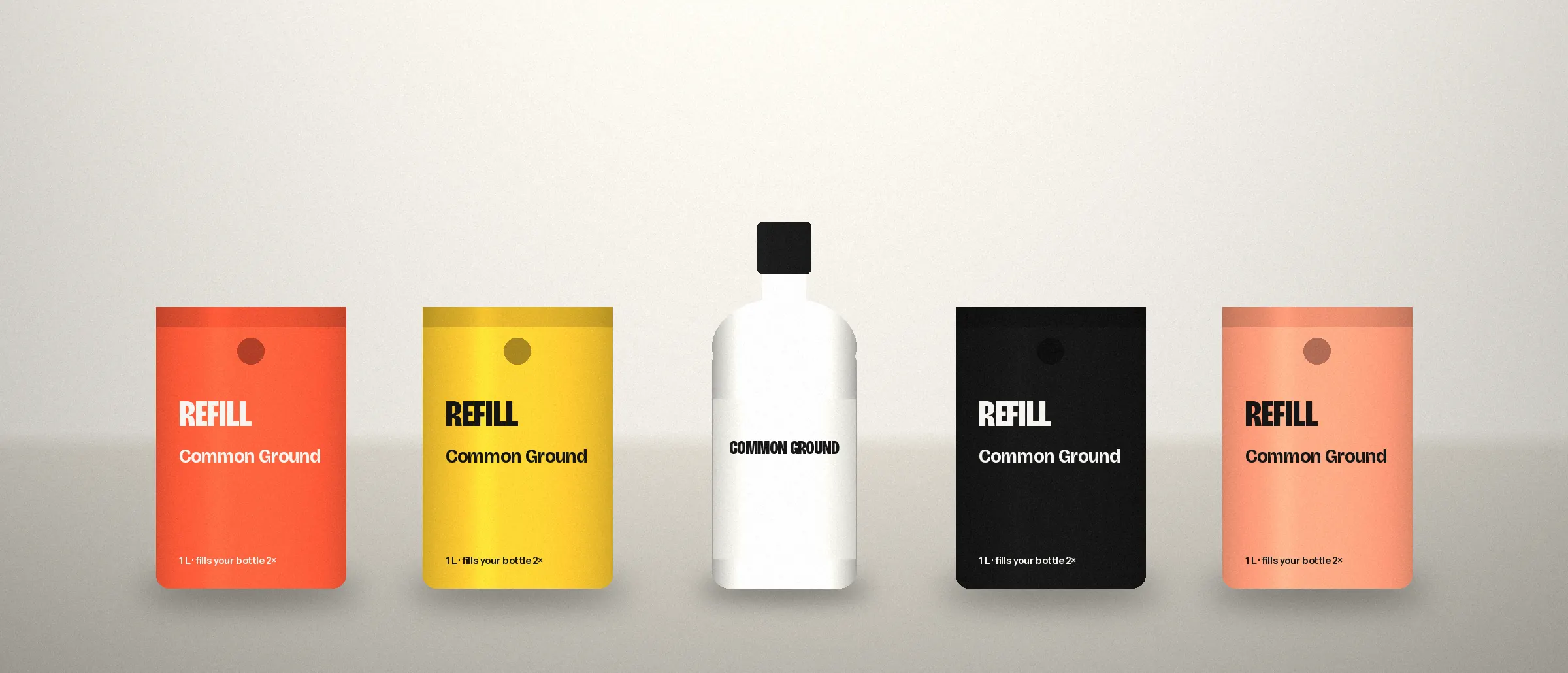
Most packaging is still signed off on a printed proof, held at arm’s length in a meeting room. Your buyer increasingly meets it somewhere else: a small square on a phone, in a grid of near-identical squares, scrolled past with a thumb.
At that size, everything a designer adds to make a pack feel considered starts working against it. Fine illustration turns to noise. A long product name becomes a grey smudge. Three claims in three badges read as clutter. The pack that won the meeting loses the scroll.
What survives at thumbnail size
Shrink your pack until it is roughly the width of a fingernail and look at what remains. Usually it is three things:
- One block of colour that belongs to you, not to the category
- One shape: the silhouette of the pack, or one bold graphic device
- One word: the brand or the product, never both at equal weight
If those three things are clear, the thumbnail does its job: it gets recognised and tapped. Everything else (the story, the ingredients, the claims) can live on the product page and on the back of the pack, where people actually read.
Where packs usually go wrong
Category colour. If every brand in your aisle uses the same green or the same gold, a fifth one disappears. Colour is the first thing the eye separates at small sizes, so it has to be yours.
Variants that look identical. In a grid, five flavours with only a change in small text look like one product listed five times. Variants need a difference you can see before you can read.
Hierarchy by committee. When the brand, the product name, the hero claim and a certification all compete for the front, nothing wins. Pick one to lead.
A five-minute test you can run today
Screenshot a search results page on Amazon, Blinkit or Zepto with your product in it. Shrink it until you can’t read any text, then ask someone outside the business to point at your brand. If they hesitate, your pack is designed for the shelf you used to sell on, not the screen you sell on now.
That test is where our free brand clarity call starts: we put your pack beside your competitors, on shelf and on screen, and come with three honest observations on what to fix first.