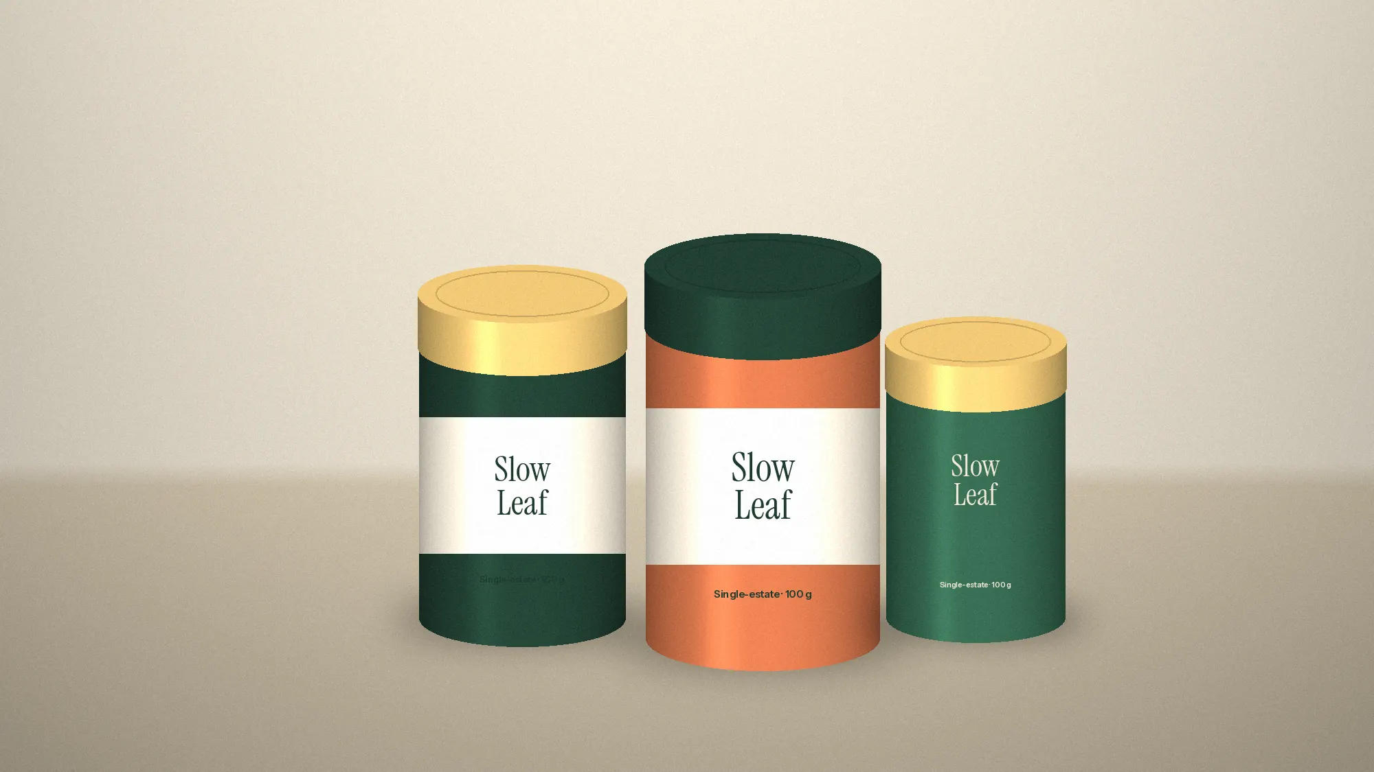
Before a customer reads a name or an ingredient, they’ve already decided something. They’ve judged the weight, the texture and how much empty space the pack allows itself. Premium is a feeling formed in the hand and the eye long before it becomes a claim on the label.
Restraint is the clearest signal. Packs that try to say everything look anxious. Packs that say one thing, with room around it, look confident, and confidence is what people read as quality.
Material and structure matter as much as graphics. A lid that closes with a soft resistance, a fold that has to be opened deliberately, a stock that holds ink with depth: these cost less than a bigger logo and do more for the price you’re asking.
That’s why we design packaging from the moment of opening, not the front face. The shelf earns the pick-up. The opening is what makes someone keep it.